2026-2027 Activewear Color Trends: What's Next in Yoga and Fitness Fashion
- Share
- publisher
- bella
- Issue Time
- Jul 20,2026
Summary
Complete guide to 2026-2027 activewear color trends. Transformative Teal, earth tones, healing pastels, digital brights, and practical color strategy for activewear collections. Includes FAQ.

Quick answer
What colors are trending for activewear in 2026–2027?
For 2026–2027 activewear, build a palette around teal and deep neutrals, add earth tones or soft pastels for studio wear, and use brighter blue or purple as seasonal accents. WGSN and Coloro named Transformative Teal their 2026 Color of the Year and Luminous Blue their 2027 choice. For a practical collection, start with one dependable base, one seasonal shade and one accent. Check each color on the intended fabric, including opacity under stretch and colorfastness, before approving production.
Color is one of the most powerful tools in activewear design. The right color palette can define a brand, influence purchasing decisions, and set collections apart in a crowded market. As we move into 2026–2027, activewear color trends are being shaped by three major forces: a desire for connection with nature, the influence of digital culture, and a growing emphasis on wellness and mindfulness.
This guide connects sportswear color trends for 2026 with practical planning for 2027. Explore teal, earth tones, pastels, digital brights and versatile neutrals, with guidance for turning those directions into a coordinated collection. The product pairings and development suggestions below are Bloomto’s editorial interpretation; a forecast does not establish which color will sell best for a particular brand.
For a coordinated studio range, compare silhouettes in our custom yoga sets collection, then review the color-coordination options in our custom yoga set manufacturing solutions.
Activewear color trends 2026–2027 at a glance
Choose colors by their role in the collection. These are suggested applications and combinations, not a ranking of consumer demand.
| Color direction | Suggested role | Suggested pairing | Check before production |
|---|---|---|---|
| Transformative Teal | 2026 statement color or alternative dark for leggings and sets | Cream, gray or clay | Shade agreement between the bra, leggings and trims |
| Luminous Blue | 2027 statement color for training and studio collections | Clay or off-white | Color transfer where deep blue meets pale panels |
| Sage, moss and forest green | Nature-inspired yoga and everyday activewear | Sand, cream or terracotta | How the shade changes on brushed versus smooth fabric |
| Lavender, soft blue and peach | Seasonal yoga and Pilates pieces | Deep gray or warm cream | Opacity under stretch and lining visibility |
| Purple and digital brights | Accent panels, straps or a limited statement style | Charcoal or a quiet neutral | Colorfastness and the appearance of contrast details |
| Wax Paper and warm cream | Light neutral for layering and tonal outfits | Teal, sage or burgundy | Coverage, seam allowance and cup visibility |
| Deep gray | Repeatable core color across several styles | Lavender, blue or oxblood | Consistent undertone across different fabric bases |
| Burgundy and oxblood | Autumn/winter capsule or rich seasonal accent | Gray, black or cream | Wash and rubbing performance, especially beside light fabric |
1. Transformative Teal: The Color of the Year 2026
WGSN and Coloro named Transformative Teal their Color of the Year for 2026. This blue-green shade can serve as an alternative to conventional dark neutrals in leggings, sports bras and everyday activewear. Try it as the main color in a matching set, with cream binding or a gray layering piece.
WGSN’s A/W 2026–2027 color forecast also identifies Wax Paper, Fresh Purple, Cocoa Powder and Green Glow. These are broader design forecasts; the activewear applications in this article are our recommendations.
What changes for 2027? Add Luminous Blue
WGSN and Coloro’s 2027 Color of the Year, Luminous Blue, provides a distinct blue direction for the following year. A practical transition is to retain core neutrals, test blue in an established silhouette, and compare its response with the previous teal collection. For the full seasonal palette, see our S/S 2027 yoga wear color trends guide.
2. The Organic Earth Palette
Moss green, sage, clay, terracotta, sand, camel and deep forest green give activewear a nature-inspired direction. Sage and sand can support a quiet studio palette; forest green and terracotta create a stronger seasonal contrast. Use these shades across related fabrics, then compare the finished garments together rather than judging isolated swatches.
For brands exploring sustainable activewear color trends in 2026, separate the visual theme from the material claim. An earthy color does not establish environmental performance. Review the actual fiber composition, relevant certification scope and dyeing or finishing information before making a sustainability claim.
3. Soft Pastels: Lavender, Soft Blue and Peach
Lavender, powder blue, peach and muted pink offer a softer direction for yoga, Pilates and athleisure. Lavender with deep gray creates contrast without a neon effect; powder blue with cream can work as a light tonal outfit; peach can add warmth to a neutral collection.
These colors can work in seamless and cut-and-sew styles, but pale shades need garment-level testing. Check leggings during bending and stretching, and assess whether a sports bra’s cups, lining or seam allowances show through. The color name alone tells you nothing about coverage.
4. Electric Purple and Bold Digital Brights
Electric purple, bright blue, yellow and coral offer a more expressive contrast to earthy and pastel palettes. Use a bright color on a full garment when it fits the brand’s audience, or introduce it through straps, binding and small panels when a subtler test is more appropriate.
“Electric purple” here describes a broad styling direction; it should not be treated as an exact match to WGSN’s named Fresh Purple shade. Define the intended color with a physical reference. Test customer interest before expanding a bright across multiple styles, rather than assuming that an eye-catching image will translate into sales.
5. Wax Paper: A Warm Neutral for 2026–2027
Wax Paper is a creamy near-neutral in WGSN and Coloro’s A/W 26/27 forecast. It offers a warmer option than stark white and can connect earth tones, pastels and brighter accents in one collection. Consider it for layering pieces, tonal outfits or contrast details.
For leggings and fitted tops, approve the intended lining and construction alongside the shade. A light swatch that looks opaque on a table may behave differently when worn and stretched.
6. Deep Gray: A Versatile Core Neutral
Deep gray remains a useful option for brands that want a softer alternative to black. Cool and warm gray undertones create different results beside lavender, blue, burgundy or cream, so choose one reference and compare it across all fabrics in the range.
To carry a gray base through different silhouettes, compare fitted and flared options in our custom yoga leggings collection. Keep the chosen fit consistent when testing a new color so the launch gives clearer feedback about the color itself.
7. Burgundy and Oxblood: Rich Seasonal Colors
Burgundy and its deeper relative, oxblood, offer a rich direction for autumn/winter activewear. Both can pair with gray, black and cream, making them useful for a seasonal capsule that still works with existing core pieces.
For dark-red garments with cream panels or trim, review color transfer during washing, perspiration and rubbing. Assess the assembled garment as well as individual fabrics, because adjacent components may behave differently.
8. Color Application Strategies for Activewear Collections
When applying athletic wear color trends in 2026 and 2027, give each shade a clear job. The familiar 60–30–10 approach can be a starting point for visual balance: a dominant neutral, a secondary color and a small accent. It is a styling guide, not a proven ratio for purchase quantities or sales.
- Color blocking: repeat one accent through straps, a waistband or selected panels.
- Monochromatic outfits: coordinate the same shade or a deliberate tonal variation across the top and bottom.
- Seasonal capsules: test two or three colors on established styles before expanding the range.
- Gradients and dip-dye: approve the actual placement and transition on a garment sample; a solid-color lab dip is insufficient for an effect.
| Collection | Example palette | How to apply it | Development priority |
|---|---|---|---|
| Yoga and Pilates | Sage + cream + lavender | One main shade across a bra-and-legging set | Opacity, lining coverage and a consistent finish |
| Gym and training | Deep gray + blue + a bright accent | A neutral base with selected contrast details | Colorfastness, panel matching and clear logo contrast |
| Everyday athleisure | Teal + clay + warm cream | Tonal separates with a coordinating layering piece | Mix-and-match compatibility across fabric textures |
For construction details, our guide to custom sports bra and leggings matching sets explains how to coordinate materials, trims and dye lots. For a legging-led capsule, review our custom leggings manufacturing solutions alongside your intended color and fit.
9. Fabric and Finish Considerations for Color
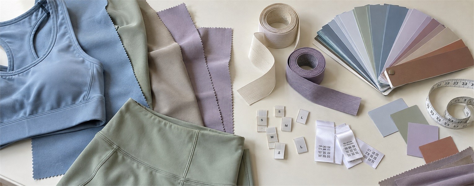
The same color reference can look different on nylon-spandex, polyester-spandex, cotton or lyocell blends. Fiber composition, yarn, knit structure, dyeing and finish all affect the result. Brushed, ribbed, smooth and lustrous surfaces should be compared on the actual production material; nylon is not always deeper, and polyester is not always more matte.
Always request lab dips on your actual fabric before committing to bulk production. Review the approved shade alongside the intended lining, elastic, thread and logo. A screen image or a color name alone is not an adequate production standard.
| Specification | What to record | What to review |
|---|---|---|
| Physical color reference | Named color system and code, or an approved physical master | Lab dip on each actual fabric; keep the signed reference |
| Fabric identity | Composition, knit structure, finish, target GSM and agreed tolerance | Shade and hand feel on the specified material, not a substitute |
| Lighting and shade agreement | Agreed viewing conditions and shade-acceptance procedure | Top, bottom and trims together under the selected lighting |
| Opacity and lining | Garment size, intended fit, lining and movement-check procedure | Coverage under stretch, seam visibility and visible cups |
| Colorfastness | Required wash, perspiration and rubbing tests, with agreed acceptance criteria | Color change and staining, including dark-to-light combinations |
| Prints and special effects | Artwork scale, placement and gradient or dip-dye reference | Approved strike-off or garment sample on the intended substrate |
| Bulk and reorder control | Dye-lot identity, retained swatch and approval record | Bulk material against the approved reference before cutting |
Set project-specific tolerances and test criteria with the manufacturer. There is no single GSM, color-difference limit or fabric blend that guarantees the same appearance and coverage for every style.
For a deeper explanation, read activewear fabric specifications: GSM, recovery and colorfastness. Our custom activewear fabric development capabilities describe the material-development and performance-validation process.
10. From a Color Trend to a Production Brief
Before discussing a collection with Bloomto, prepare the intended customer and activity, selected styles, physical color references, fabric requirements, size range and estimated quantity per style and color. Clarify whether the project uses available fabric colors, a custom-dyed shade or a printed effect.
A fabric mill’s minimum dye quantity and a garment factory’s minimum order are different requirements. Confirm each separately for your material and construction. Existing colors or a focused capsule can simplify an initial test, but custom yarns, trims and finishes may introduce additional minimums.
If the range includes layering pieces, compare our custom yoga tops and vests collection against the core set. Brands planning a first color trial can review our custom sportswear solutions for emerging brands for the development and sampling workflow.
FAQ: Activewear Color Trends
What colors are trending for activewear this year?
For a 2026 collection, consider Transformative Teal with earth tones, soft pastels, warm cream and deep gray. Purple or other bright accents can add contrast. For 2027 planning, include Luminous Blue in your evaluation. Choose the final palette around your audience, existing sales and sample results.
What is the difference between the 2026 and 2027 Color of the Year?
WGSN and Coloro selected Transformative Teal for 2026 and Luminous Blue for 2027. These are their forecast choices, rather than universal rankings of the best-selling activewear colors. Other forecasting organizations may make different selections.
Do color trends differ between yoga wear and performance activewear?
The intended activity and brand identity can change the palette. Earth tones and pastels can suit a quiet studio collection; deep neutrals with brighter accents can suit a training range. Neither category has to follow one palette. Test the combination with the intended users and garment construction.
How can small brands introduce trend colors without a large initial order?
Start with available fabric colors, established styles and a limited number of colorways. An accent detail may use less material than a full garment, but trims can have their own minimums. Confirm the garment MOQ and any separate fabric-dyeing minimum before placing an order.
Are light-colored leggings always see-through?
No. Coverage depends on fabric construction, weight, stretch, fit and lining as well as color. Check the intended garment size during movement and under consistent lighting. A heavier fabric or darker shade alone does not guarantee opacity.
Can the same color match exactly across a sports bra and leggings?
A shared color reference helps, but different fabrics, finishes, linings and dye lots can create visible differences. Review both pieces together, approve lab dips on each material, and retain an approved set as the bulk-production reference.
How many colors should a first activewear capsule include?
Three main color roles can provide a manageable starting point: a core neutral, a seasonal shade and an accent. The final number depends on the style count, size range, minimum quantities and budget. Test demand before extending every color across the full collection.
Discuss Your Activewear Color Development
Ready to turn a palette into samples? Contact Bloomto about custom activewear colors and sampling. Share your target colors, styles, fabric requirements and estimated quantity per color so the team can review material availability, lab-dip requirements and applicable minimums.
